
How to Choose Fonts to Elevate Your Stationery Designs (+ Adobe InDesign Tutorial)
If you’re new to stationery design, you’ve probably wondered:
✔️How do I find great fonts that make my designs look high-end?
✔️How do I create balance and symmetry in my layouts?
✔️How can I use fonts to elevate my work and attract luxury clients?
Today, I’m pulling back the curtain and sharing a sneak peek into my design courses – consider this your free mini-lesson! 🎉
Let’s talk through some of the basics together and then we’ll jump into Adobe InDesign for a tutorial.
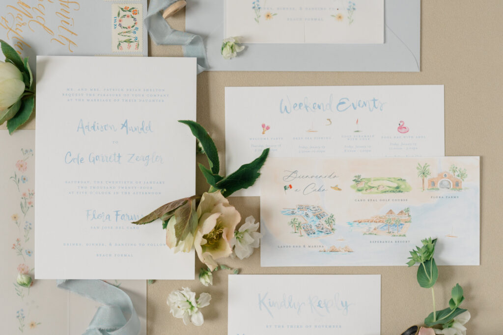
WHAT IS A FONT?
Before we start designing, let’s define what a font actually is.
A font is a variation of a typeface—the formal term for a collection of fonts. For example, Arial is a typeface, while Arial Bold is a font within that typeface.

THE 3 MAIN TYPEFACE STYLES FOR STATIONERS
There are 3 main styles of typeface that we use as stationers:
- Serif – Classic, timeless, and formal
- Sans serif – modern, clean, and minimalist
- Script – Flowing, handwritten, or calligraphy styles
Of course, there are TONS of different styles of each that we can choose from, but generally speaking, it’s good to be familiar with these categories!
ADOBE INDESIGN TUTORIAL: STYLING FONTS FOR STATIONERY
Now that we’ve covered the basics, let’s jump into Adobe InDesign and explore:
🎨 How to create text boxes in Adobe InDesign
🎨 How to choose and style fonts for stationery
🎨 How to design with balance and symmetry
TAKE THE NEXT STEP: FIND YOUR STATIONERY DESIGN STYLE!
If you’re feeling excited about the idea of creating stationery (and building a business from your work!), then your next step is to take my free quiz!
This quiz will help you:
✔ Identify your signature design style
✔ Learn how to attract your ideal clients
✔ Get clarity on how to refine your aesthetic
Leave a Reply
let's be friends
@elisabethstuckeydesign

